

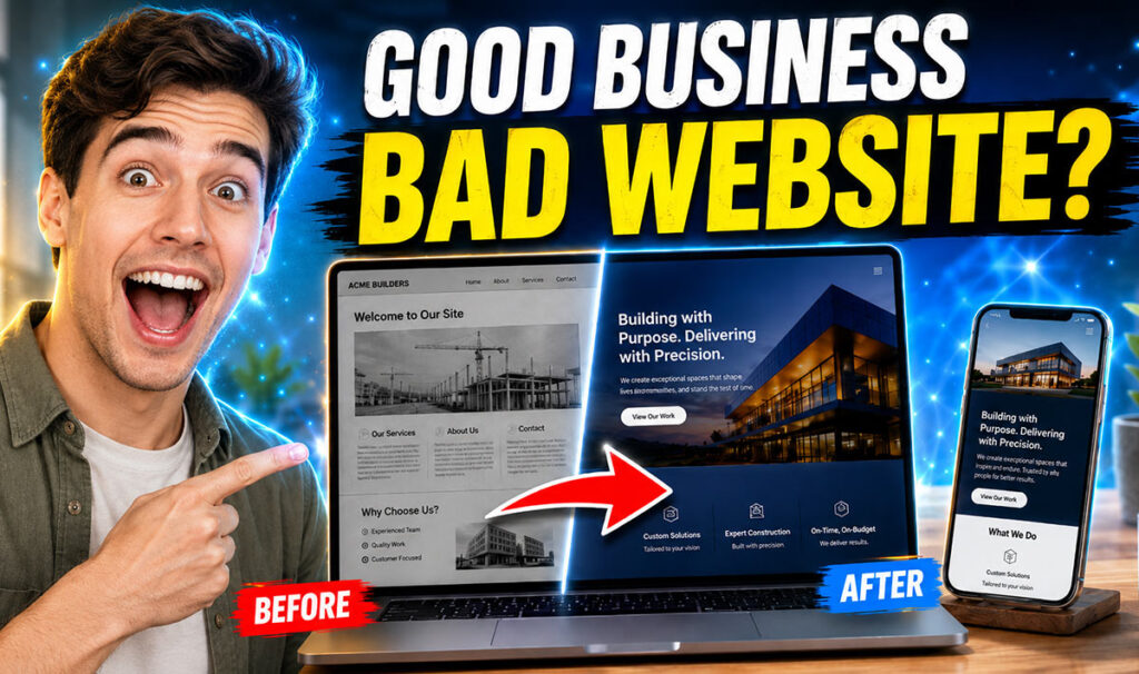
A business can deliver excellent work, earn loyal customers and solve difficult problems—yet still lose opportunities before a conversation begins.
The reason is often not the service. It is the presentation.
When a website feels dated, a logo changes across platforms, mobile pages are difficult to use, or AI-generated visuals look almost—but not completely—finished, customers notice the inconsistency before they understand the expertise behind the business.
This is the perception gap: the distance between a company’s true quality and the quality people assume from what they see online.
Closing that gap is not simply a design exercise. It is a business-growth decision.
Your Customer Meets the Interface Before the Expertise
Before a prospect speaks with your team or experiences your service, they will usually encounter a website, social post, search result, proposal or advertisement.
Each of these touchpoints answers important unspoken questions:
Is this company credible? Is the offer relevant to me? Can I understand it quickly? Does the team pay attention to detail? Will contacting them be easy?
A strong visual impression cannot replace a weak business. However, weak presentation can easily hide a strong one.
Effective design therefore begins with clarity rather than decoration. Its purpose is not merely to make a company look fashionable. It is to make its value easier to recognise, its evidence easier to trust and its next step easier to take.
The Hidden Cost of “Good Enough”
Many business websites are not visibly broken. They load, display a list of services and include a contact form. Yet they quietly create friction.
A vague headline forces visitors to work out what the company actually offers. Dense paragraphs bury the strongest benefits. Inconsistent typography weakens recognition. Generic imagery makes a specialist business feel interchangeable. An awkward mobile menu turns a simple enquiry into unnecessary effort.
Individually, these problems may appear minor. Together, they create doubt.
The cost does not arrive as a clear invoice. It appears as visitors who leave without enquiring, proposals that feel less convincing, campaigns that underperform and sales teams who must repeatedly explain what the brand should already communicate.
“Good enough” design is expensive because the loss remains largely invisible.
Strategic Design Is a Decision System
A successful redesign is not a fresh coat of colour applied to old confusion. It is a connected sequence of decisions that aligns business goals with customer needs.
The process begins with diagnosis.
What must visitors understand first? Which service creates the greatest value? Where do prospects become uncertain? What evidence reduces risk? What action should they take next? Which information deserves priority on a smaller screen?
The answers create the structure. Typography, colour, imagery, movement and layout then support that structure.
This changes design from personal preference—“I like this style”—into practical reasoning:
“This hierarchy explains the offer.”
“This case study builds confidence.”
“This call-to-action reduces hesitation.”
Beautiful design attracts attention. Strategic design directs it.
Five Ways to Close the Perception Gap
1. Lead With a Clear Business Promise
The first section of a website should not make visitors decode clever language. It should communicate the problem the business solves, the audience it serves and the value it creates.
Clarity does not have to sound ordinary. Strong creative writing gives a precise message personality without sacrificing meaning.
Instead of beginning with a generic statement such as “Welcome to our website,” begin with a customer-centred promise that gives people a reason to continue.
2. Build Proof Into the Customer Journey
Credibility should not be isolated on a forgotten testimonials page. Place proof close to the claims it supports.
Relevant case studies, measurable outcomes, client logos, process explanations, accreditations and genuine testimonials help visitors move from interest to confidence.
The strongest proof is not necessarily the loudest. It is the proof most relevant to the decision being made.
A potential client does not only want to know that previous customers were happy. They want to see whether you have solved a problem similar to theirs.
3. Design for the Mobile Decision
Mobile design is not a desktop layout squeezed into a smaller frame. Content order, typography, spacing, forms, buttons and navigation must be designed for touch from the beginning.
Google uses the mobile version of a website’s content for indexing and ranking. Its Core Web Vitals also evaluate loading performance, responsiveness and visual stability. Google’s recommended “good” thresholds include Largest Contentful Paint within 2.5 seconds, Interaction to Next Paint of 200 milliseconds or less and Cumulative Layout Shift of 0.1 or less.
Speed is not merely technical polish. It is part of the brand experience.
A slow or unstable website communicates carelessness, even when the business behind it is highly professional.
4. Create One Recognisable Visual System
A brand should not become a different personality every time it moves from a website to social media, print, advertising or presentations.
A practical brand system connects logo usage, typography, colour, imagery, spacing, icon style and tone of voice.
It gives teams enough structure to remain recognisable and enough flexibility to communicate creatively.
Consistency builds familiarity. Familiarity reduces uncertainty. When every touchpoint feels connected, the business appears more established, organised and dependable.
5. Add Human Judgement to AI-Assisted Work
Artificial intelligence can accelerate concepts, images, layouts and written content, but speed does not guarantee professional readiness.
Generated work may contain inaccurate text, inconsistent details, weak hierarchy, unsuitable dimensions or files that cannot be edited properly. Professional refinement turns a promising output into a dependable business asset by correcting errors, protecting brand consistency and preparing it for real-world use.
The future is not AI versus designers.
It is faster generation combined with stronger human judgement.
Businesses that understand this distinction can benefit from new technology without allowing rushed or unfinished creative work to damage customer trust.
Accessibility Is Professional Quality
Accessible design should not be treated as a technical requirement added at the end of a project.
Readable contrast, logical heading structures, keyboard access, descriptive image alternatives and clearly labelled forms improve the experience for a wider audience.
The World Wide Web Consortium explains that digital accessibility can enhance brand reputation, extend market reach, encourage innovation and reduce organisational risk.
An inclusive website is not only more responsible. It is usually clearer, more robust and easier for everyone to use.
Redesign the Weakest Link, Not Everything
Closing the perception gap does not always require a complete website rebuild.
Sometimes the strongest move is a focused homepage restructure, clearer service content, a mobile usability correction, a refined visual identity, a WordPress repair or the professional finishing of existing AI-generated assets.
The right question is not:
“How much can we redesign?”
It is:
“What is the smallest effective change that will create the greatest improvement?”
This principle protects budgets, shortens decision-making and keeps the project connected to a genuine business need.
Make the First Glance Earn the Next Step
Customers cannot immediately see your years of experience, internal standards or commitment to service. They begin with what is visible.
Your website and brand therefore have one critical job: make the true quality of the business easier to believe.
When the message, interface, evidence and production details work as one system, design stops being surface-level presentation. It becomes a bridge between capability and confidence.
A strong business should not have to overcome its own appearance.
Close the perception gap, and the first glance can become the beginning of a real business relationship.
At Designing Fever, we help businesses identify what feels unclear, inconsistent or unfinished—and transform it into a professional digital experience built for clarity, credibility and real-world use.