AI illustration has become shockingly good at first impressions. Type a prompt, wait a few seconds, and the screen fills with beautiful characters, icons, posters, mascots, backgrounds, fantasy scenes, product visuals, or brand-style illustrations. The colors look polished. The lighting feels cinematic. The detail is impressive.
But professional designers know a secret: looking finished is not the same as being usable.
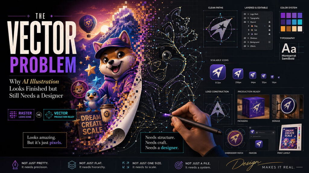
This is especially true for vector design.
A raster AI image, such as a PNG or JPG, is made of pixels. A vector file, such as SVG, AI, EPS, or properly structured PDF artwork, is made of editable paths, shapes, strokes, curves, and layers. This difference matters. A client may love an AI-generated logo concept, but if the file is not a clean vector, it cannot be properly scaled, edited, printed, embroidered, animated, cut, or used across a professional brand system.
That is the vector problem. AI can create an image that looks like vector art, but it may not behave like real vector artwork.
The Illusion of “Vector Style”
Many AI tools can generate a “flat vector style illustration.” The result may look like something made in Illustrator. It may have simple shapes, smooth colors, and clean outlines. But when the designer opens the file, it is often still a flat raster image. That means every element is baked into one image.
The character’s hair is not a separate shape. The background is not editable. The shadow is not a separate object. The text is not live text. The logo is not built from clean curves. The color palette cannot be changed globally. The file may look clean on Instagram, but it is not production-ready for a brand identity package.
This matters because real graphic design often requires revision. A client may say, “Make the jacket blue,” “Move the icon slightly,” “Change the expression,” “Remove the background,” “Use this mascot on a billboard,” or “Turn this into an embroidered patch.” If the AI image is flat, the designer must either regenerate it and risk new mistakes or manually redraw it.
That is why designers still need Illustrator, Figma, Photoshop, or other professional tools.
Real-Life Use Case: Mascot Illustration
Imagine a small food brand wants a cute mascot. AI can generate 20 character ideas quickly: a smiling dumpling, a friendly noodle bowl, a cheerful mango, or a playful coffee cup. This is an excellent use case. The designer can use AI to explore personality, pose, color, mood, and style.
But when the client chooses one mascot, the real work begins.
The final mascot needs consistent shapes. The face must stay the same across poses. The colors must match the brand palette. The outlines must be clean. The file must be scalable. The mascot may need a happy pose, a waving pose, a holding-product pose, a sticker version, a black-and-white version, and a tiny favicon version.
AI may generate each pose slightly differently. The eyes may change. The mouth may shift. The body shape may become inconsistent. Small details may disappear. The mascot may look like a cousin of the original instead of the same character.
A designer must standardize the character. That may mean redrawing the mascot as vector artwork, building a style guide, setting approved colors, defining facial features, and creating a reusable illustration system.
AI creates inspiration. The designer creates identity.
Why Logos Are Even More Sensitive
Logo design is one area where AI must be used carefully. A logo is not only a picture. It is a legal, strategic, and technical brand asset. It must be simple, memorable, scalable, original, and usable in many contexts. It must work on a business card, a website header, a social profile, packaging, signage, invoices, uniforms, and sometimes vehicles.
AI may generate attractive logo-looking images, but it can also create generic symbols, messy geometry, unreadable text, or shapes that are too complex. It may accidentally produce marks that feel similar to existing brands. It may generate a beautiful emblem that cannot be simplified. It may create typography that looks stylish but is not a real font.
For professional logo design, AI is best used for early exploration, not final delivery. The designer still needs to research competitors, sketch directions, build a clean vector mark, choose typography intentionally, test the logo in black and white, create spacing rules, prepare file formats, and deliver a proper brand package.
A client should not receive only a PNG and be told, “Here is your logo.” That is not professional brand design.
The Problem With AI Text in Graphics
AI image tools have improved at text, but text in graphics is still a risk. A poster may look great until you zoom in and notice broken letters, strange spacing, fake words, incorrect spelling, or inconsistent fonts. This is dangerous for ads, political graphics, educational posters, event flyers, product packaging, and social media campaigns.
Professional designers should not rely on AI-generated text baked into an image. The safer workflow is to generate the visual without final text, then add real typography manually in Photoshop, Illustrator, Figma, Canva, or InDesign. This gives the designer control over spelling, hierarchy, alignment, tracking, kerning, readability, and brand fonts.
In design, one wrong letter can damage trust.
AI Illustration Is Strongest When Used as a Sketch Partner
The best use of AI illustration is not “make my final file.” It is “help me explore possibilities.”
A designer can use AI to test art styles, character moods, composition ideas, color palettes, background concepts, icon metaphors, and campaign visuals. This is extremely useful. Instead of staring at a blank canvas, the designer can quickly see many directions and choose the most promising one.
But the chosen direction should be refined manually. The designer may trace, redraw, simplify, separate layers, clean curves, rebuild typography, adjust colors, and prepare final exports. This process turns AI inspiration into professional artwork.
The difference is similar to the difference between a rough sketch and a final illustration. A sketch can be brilliant, but it is not always the deliverable.
What “Production-Ready” Really Means
A production-ready illustration or vector design should be:
- Editable.
- Scalable.
- Cleanly structured.
- Consistent with the brand.
- Readable at small sizes.
- Exported in the right formats.
- Free of strange artifacts.
- Correct in spelling and layout.
- Usable across print and digital platforms.
- Easy for another designer or developer to open and modify.
AI-generated artwork often fails at one or more of these points. That does not make AI bad. It simply means the designer must finish the job.
The New Role of the Designer
The designer’s role is becoming more like an art director, editor, quality controller, and production specialist combined. The designer decides which AI output has potential. The designer protects the brand. The designer fixes what the machine gets wrong. The designer turns a beautiful flat image into a usable design system.
This is valuable work.
In fact, AI may make professional designers more important, not less. When anyone can generate a nice-looking image, the real difference becomes quality control, originality, consistency, and execution. The world will not have fewer visuals. It will have more visuals than ever. That means brands will need designers who can separate polished work from AI noise.
Final Thought
AI illustration is exciting. It can speed up creativity, unlock new ideas, and help designers explore styles faster than before. But for professional vector design, logo work, character systems, and brand illustration, AI is not a full replacement for human craft.
A generated image can look finished.
A designer makes it usable.
That is the difference between AI art and professional design.