

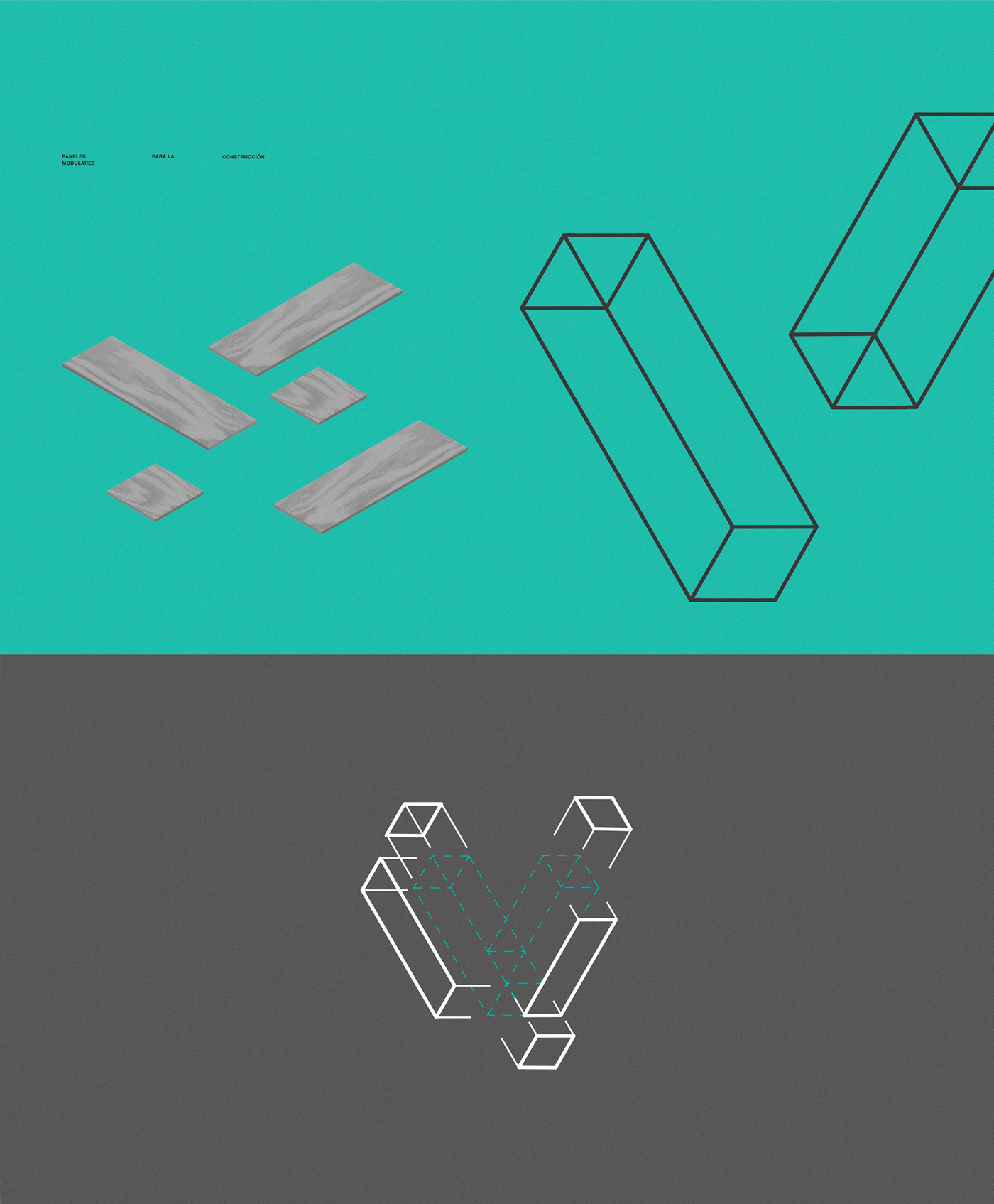
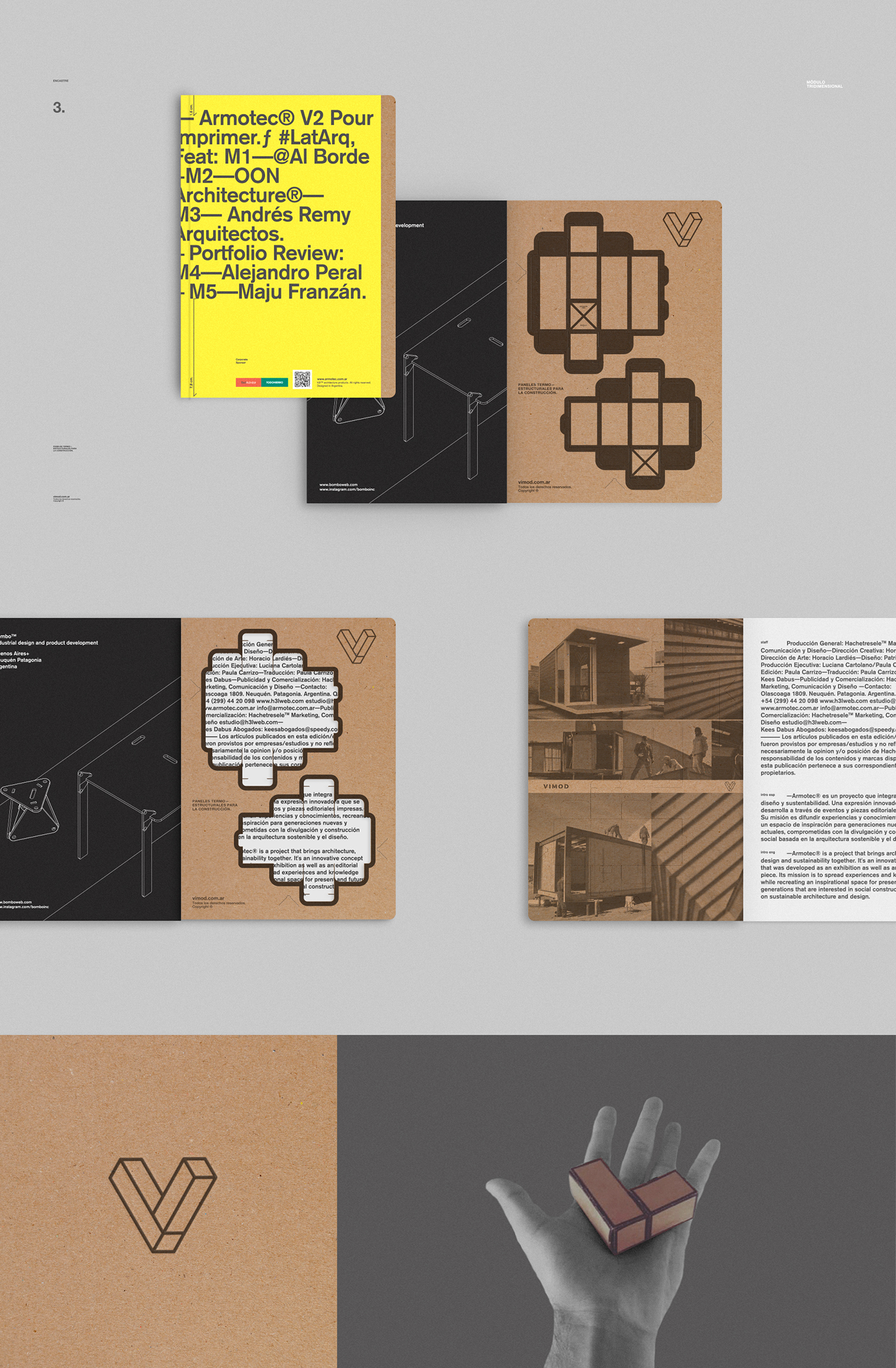
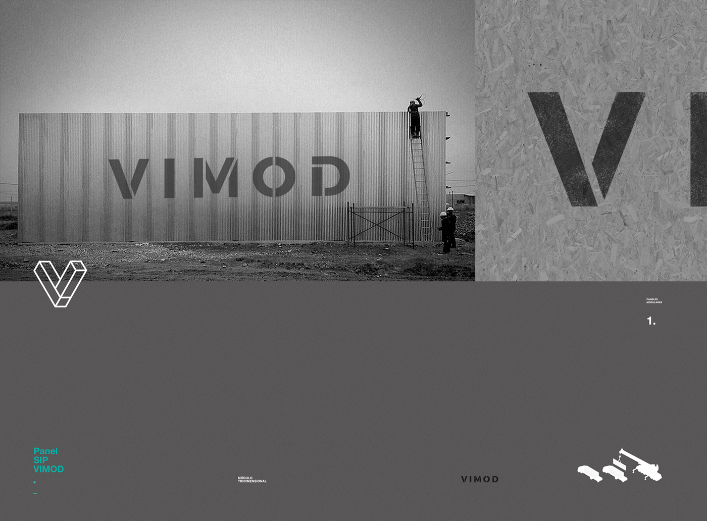
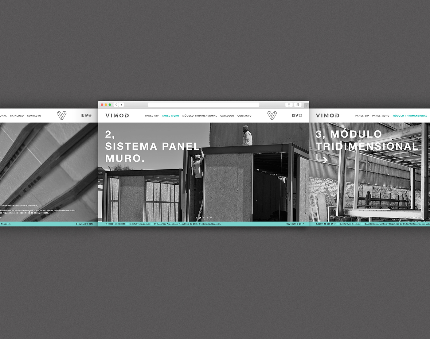
The new brand identity for VIMOD was based on the module-design concept and was included in different elements: corporate stationery, web design and social media animations. This branding project and image update begins with the definition of both, a new isotype and logo. The new brand identity design represents a synthesis of a functional, modular construction system.
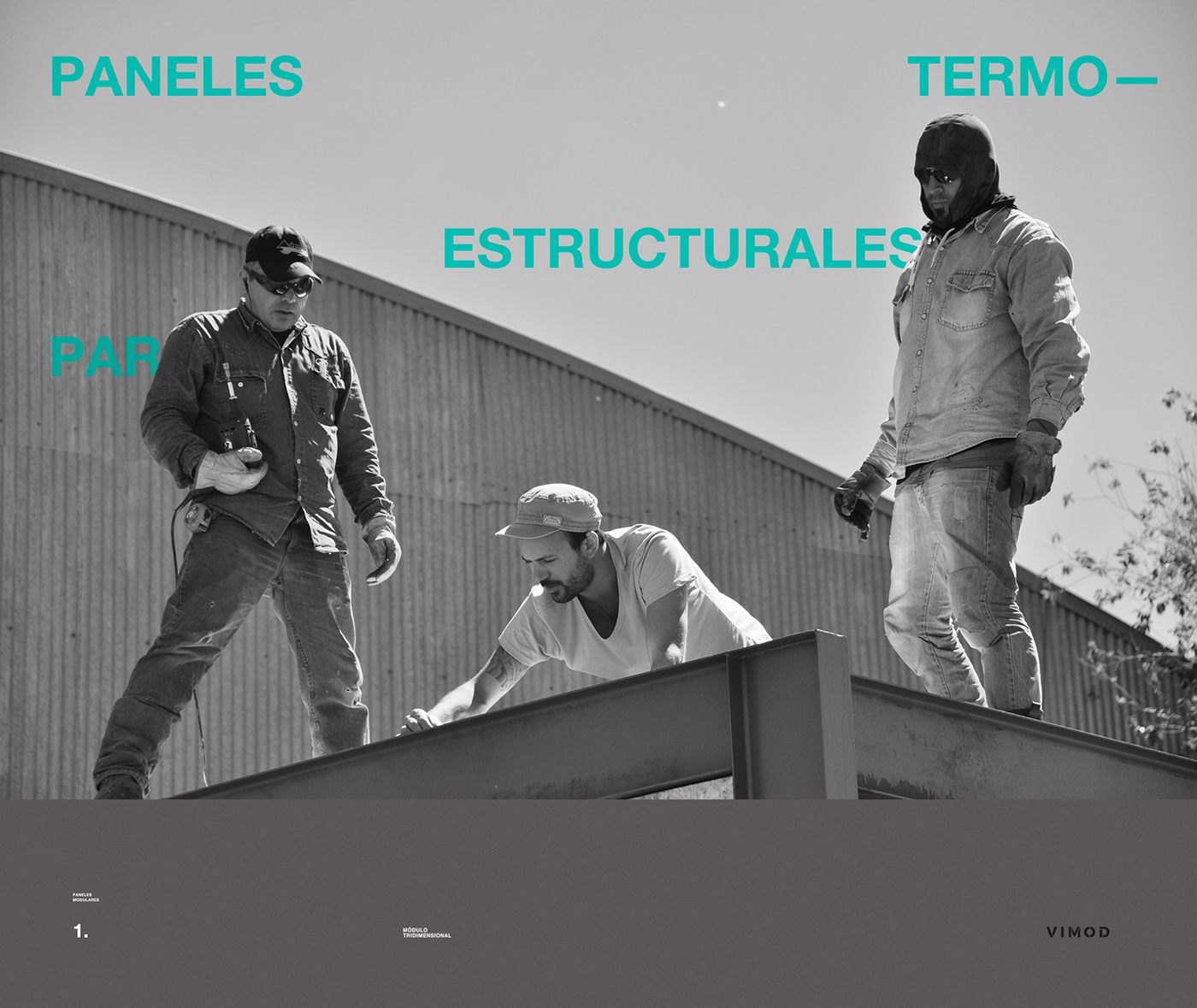
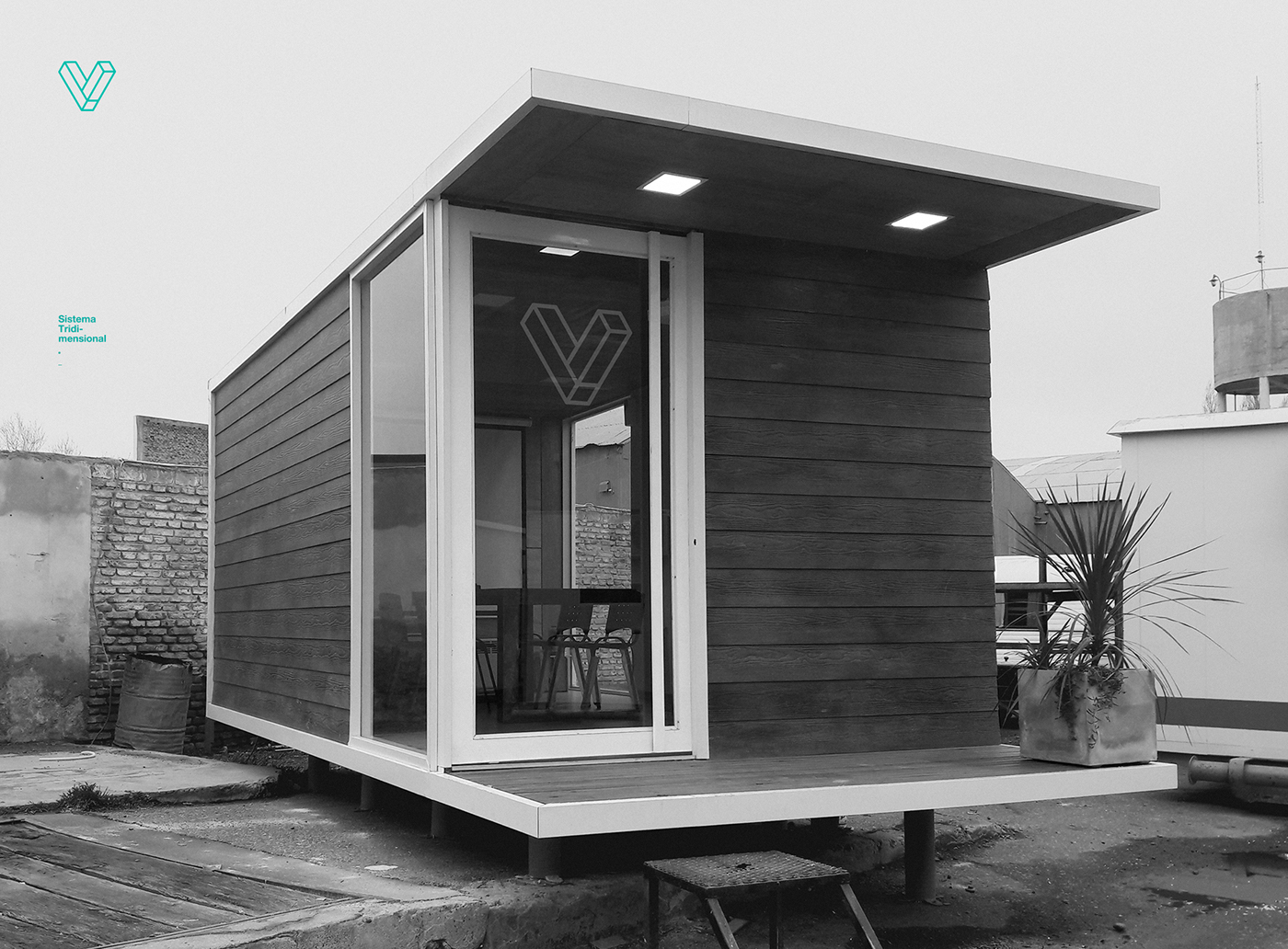
The power of simplicity expresses itself through a unique element, that summarizes a unique identity. The combination of useful and beautiful. Utility and aesthetics combined. Spaces are designed meticulously with great attention to detail. Textures are smooth. Metals that are cold to touch and natural wood become part of the environment, harmoniously. To design and to integrate. Straight lines and simple cuts create a new, sophisticated brand image. A functional system is the one that brings technical exigencies and artistic results together.
Brand Identity


h3l©
Hachetresele is an independent studio that stands out for innovative ideas and creative work.
Our team develops commercial and art projects of global significance. USA, CANADA, SPAIN, GERMANY, CHINA, TANZANIA, BRAZIL, CHILE+. Over the past decade, our practice has led to a sustainable approach to architecture, education and services, through a wide range of work. It has been named by the Presidency of Argentina as one of the most relevant studios and globally recognised as one of the most transcendent creative hubs in Latin America by TASCHEN. For more information check out: http://www.h3lweb.com/