
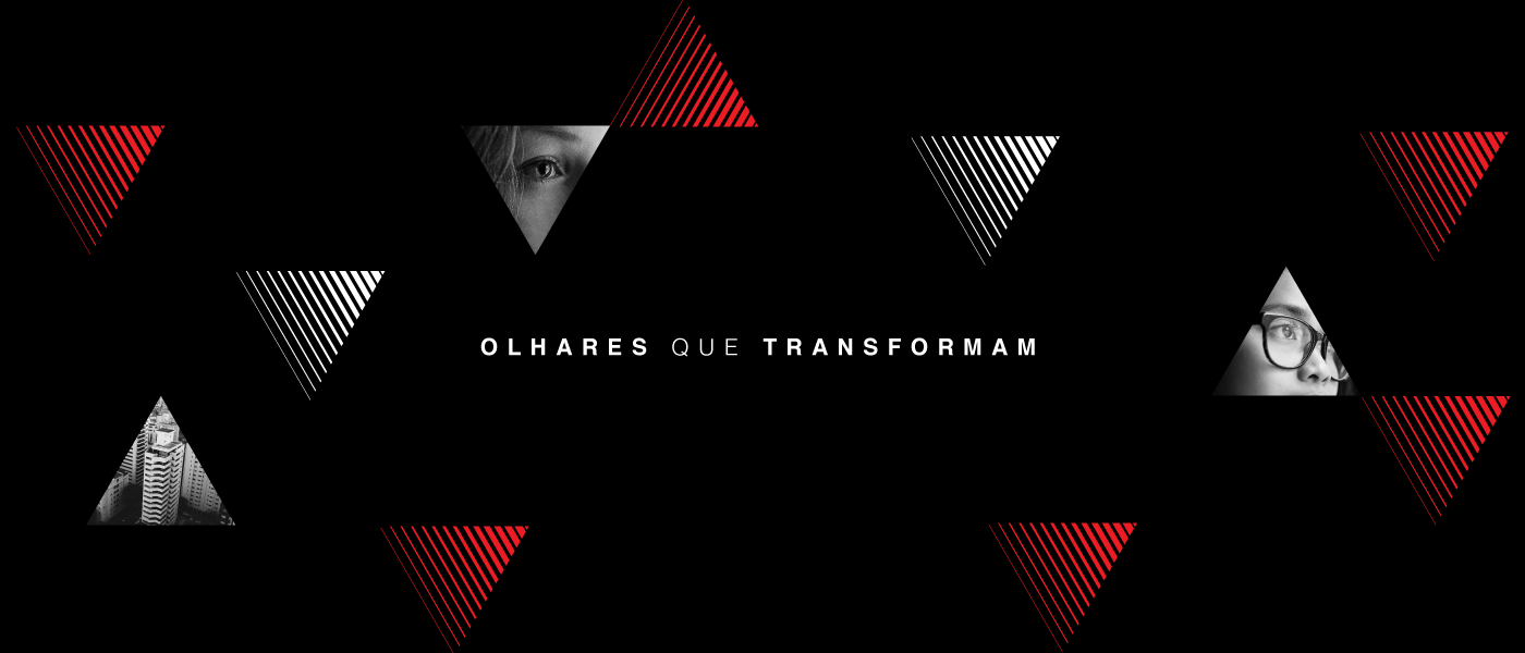
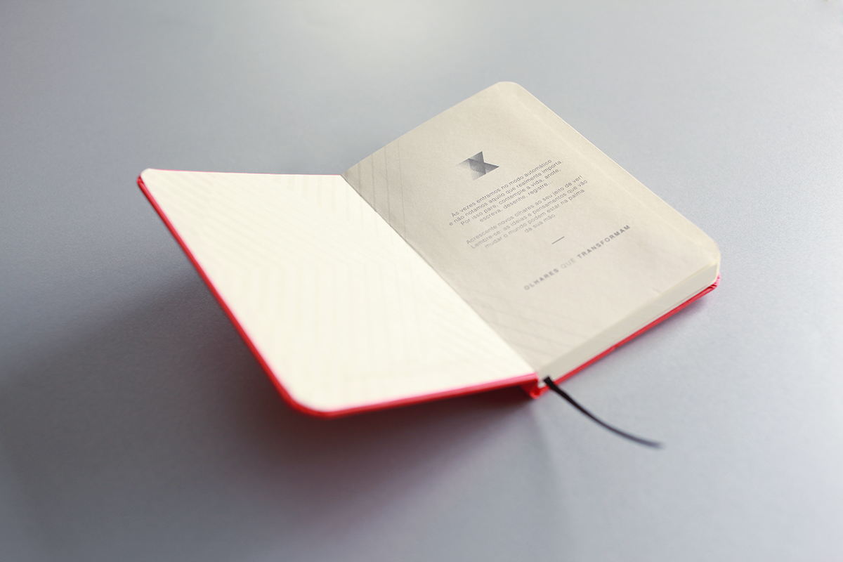
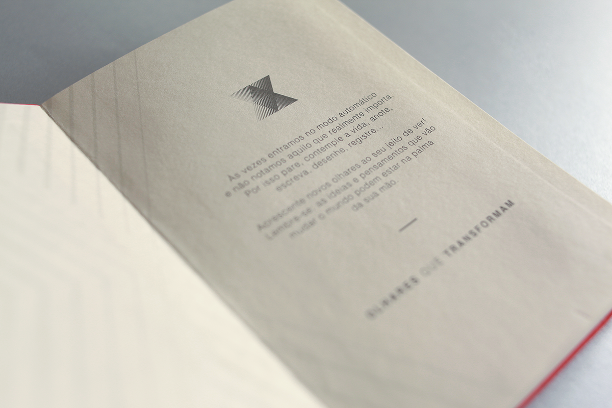
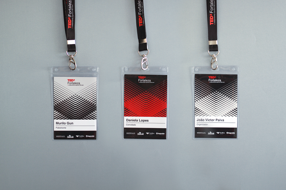
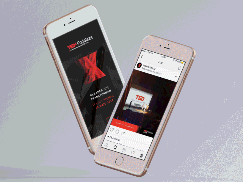
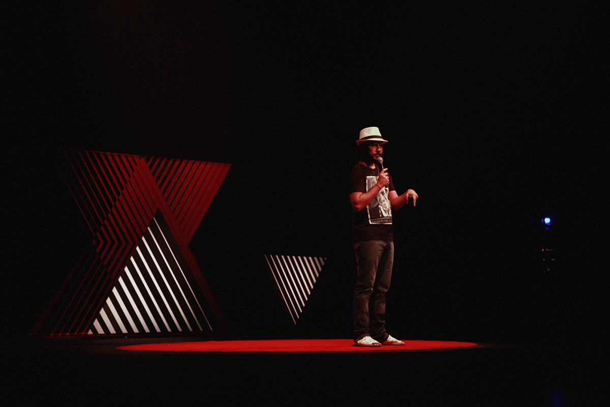
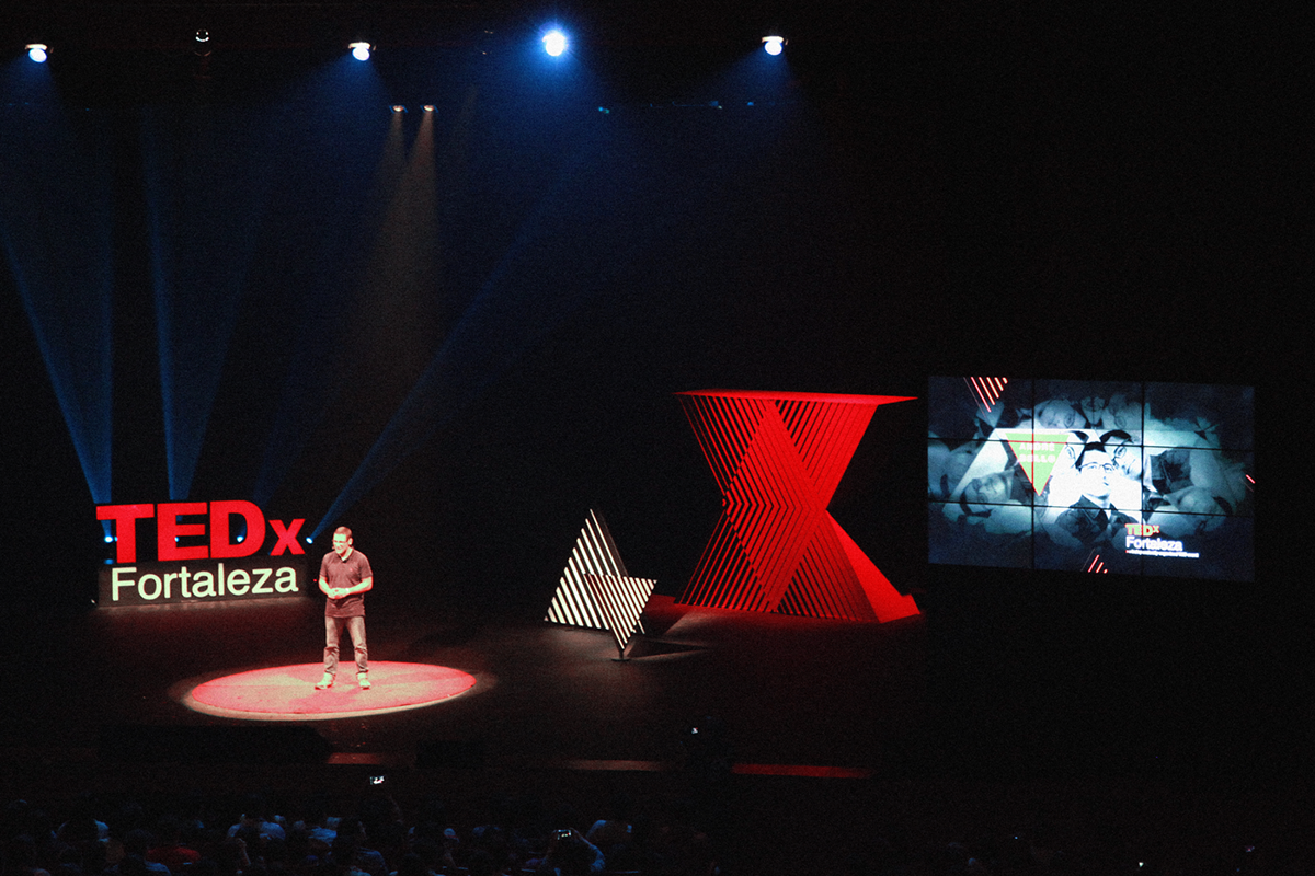
Vibri was in charge of TEDx Fortaleza’s visual identity. The concept “looks that transform”
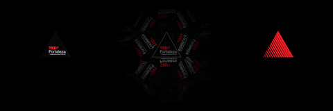
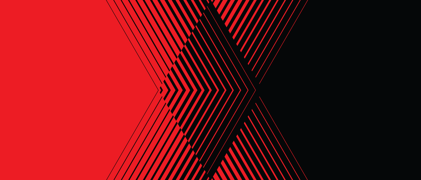
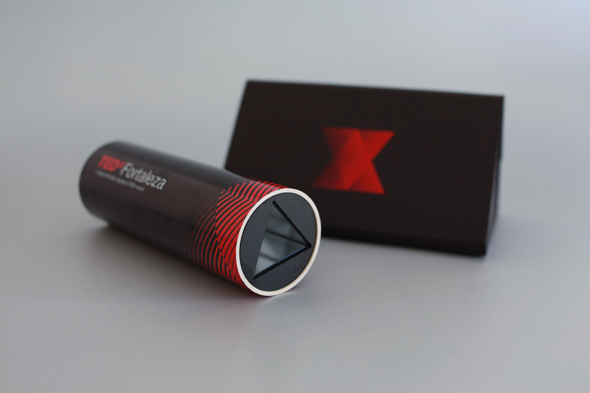
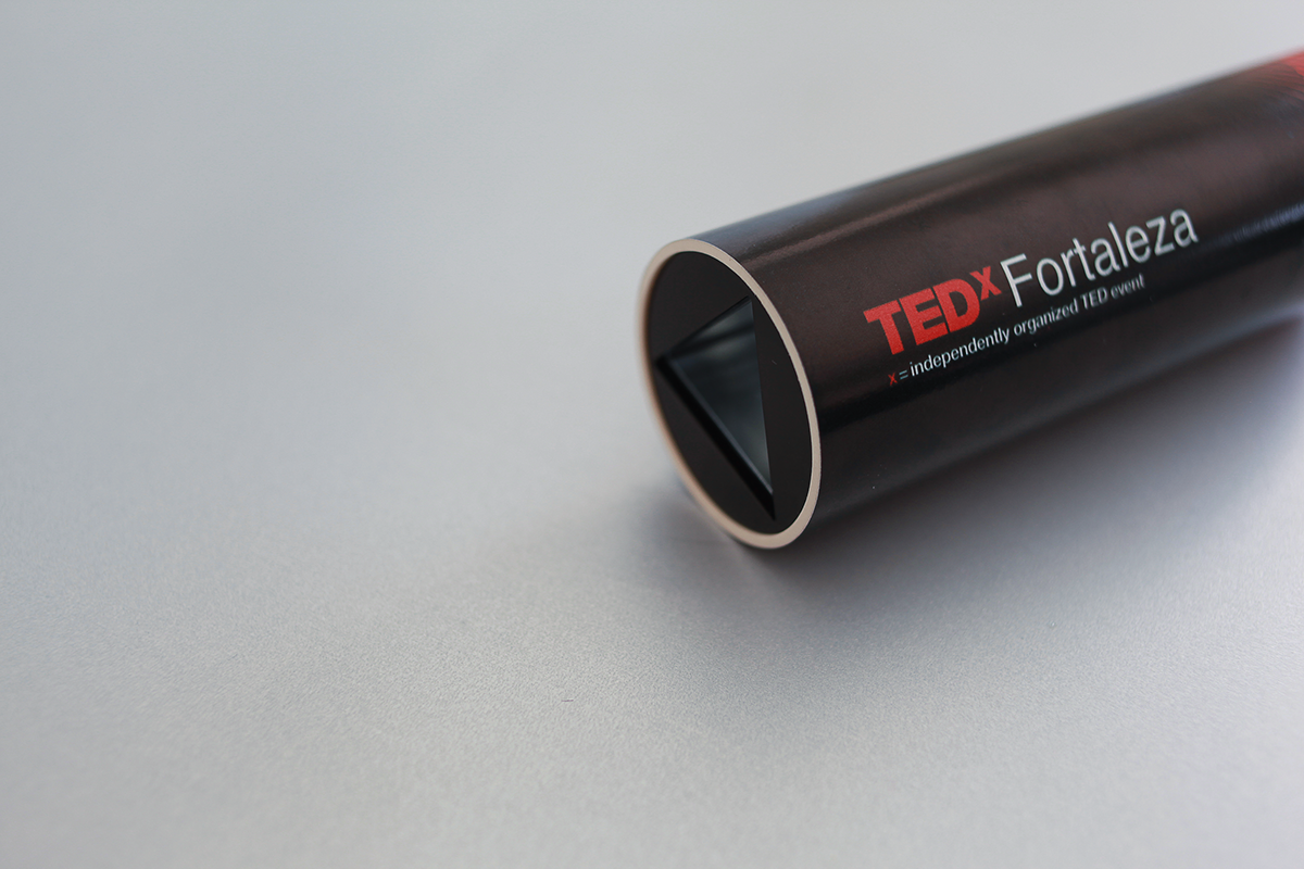
, designed in partnership with Matuta agency, is about empathy, a bout try to see the world through other eyes. To translate this, they used the kaleidoscope as a starting point. Its central triangular image that radiates in all directions seemed to be a good metaphor. Symbols and graphics were developed, making reference to the op art and playing with different looks and views.
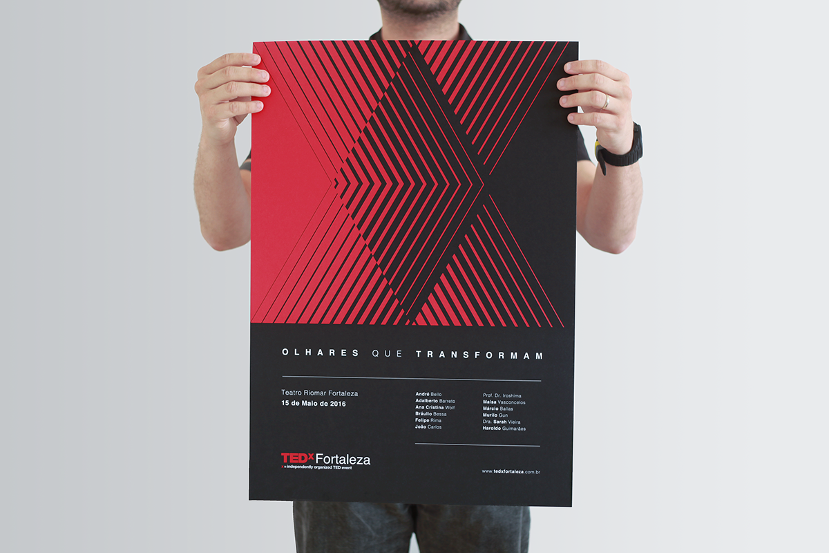
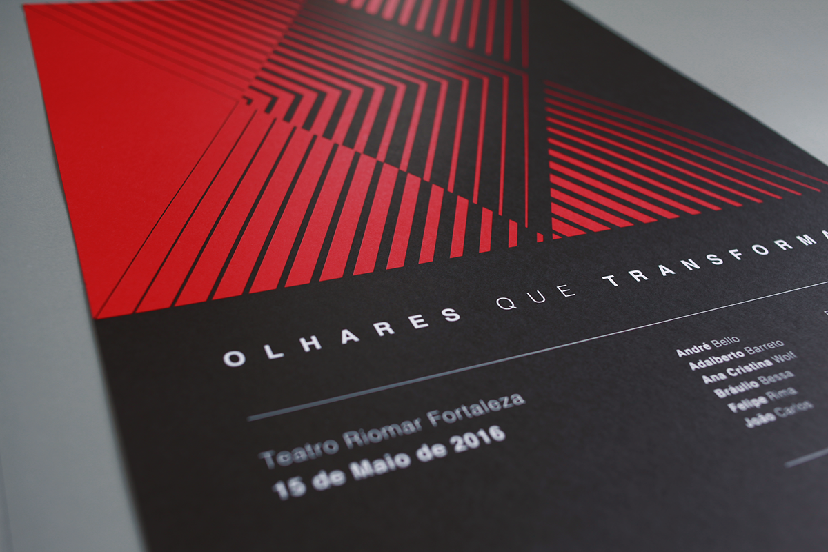
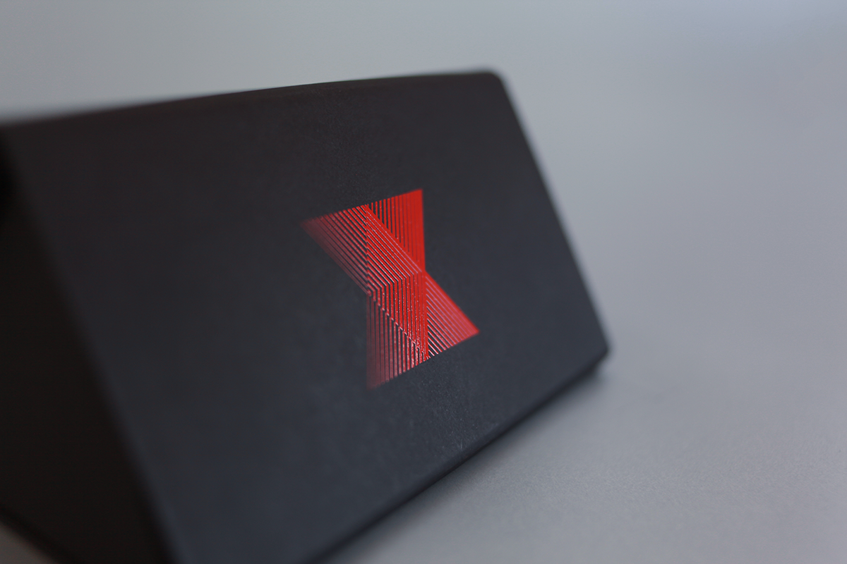
Among all the materials and collaterals created, the poster in my opinion really shines. They achieved this retro yet modern look playing with a very dark theme. I feel that red and black can be quite daunting to work with but Vibri really excelled at branding this TED event.
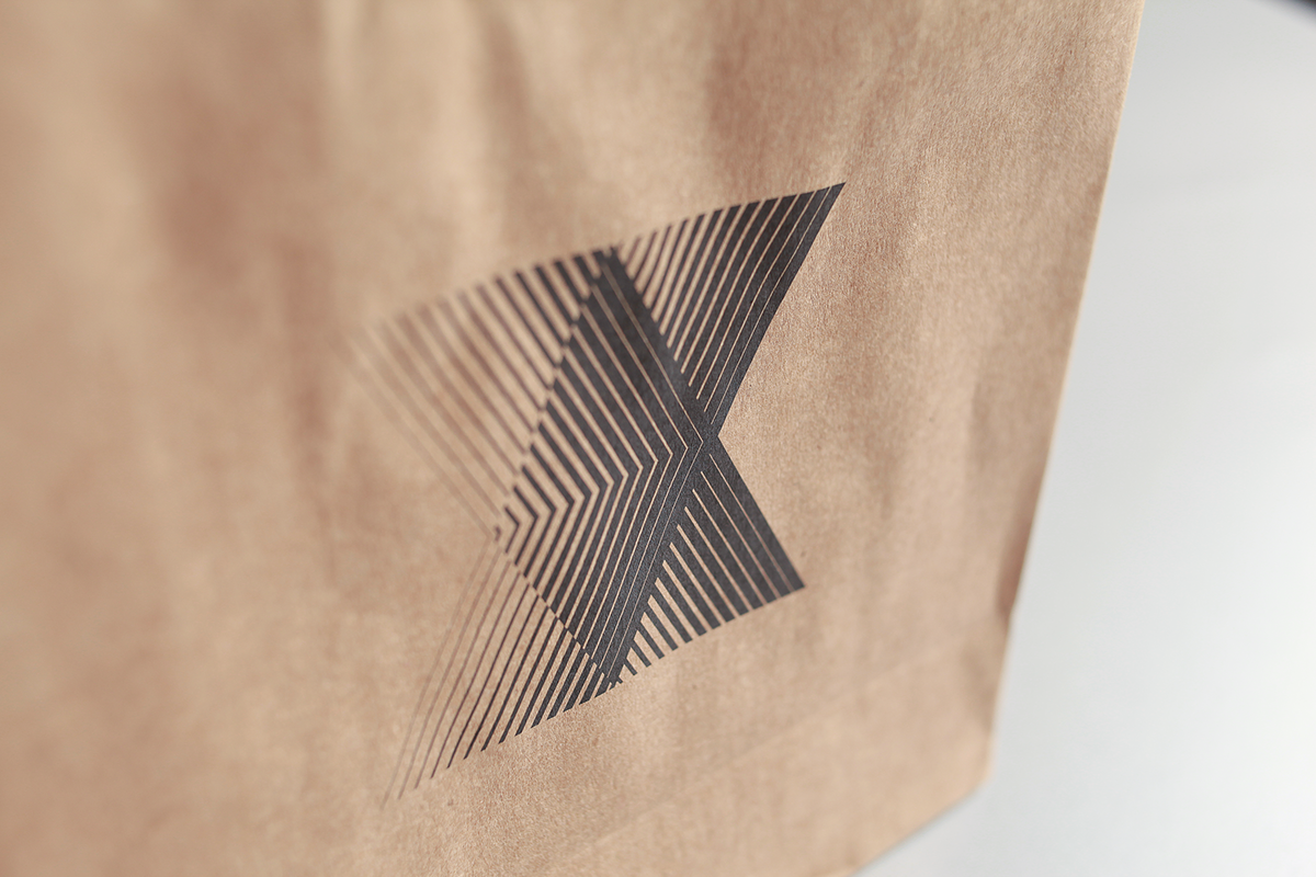
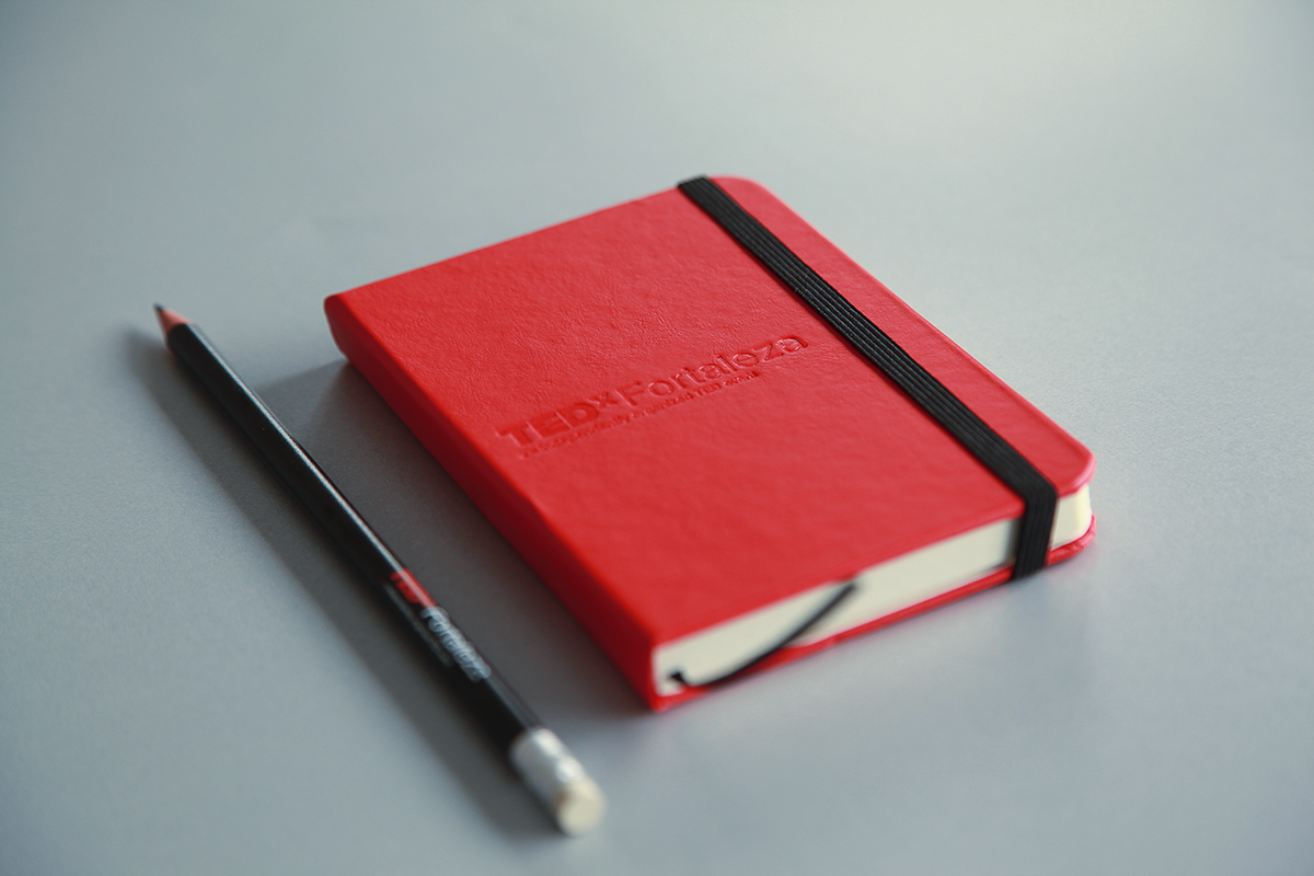
Basic branding concept and identity
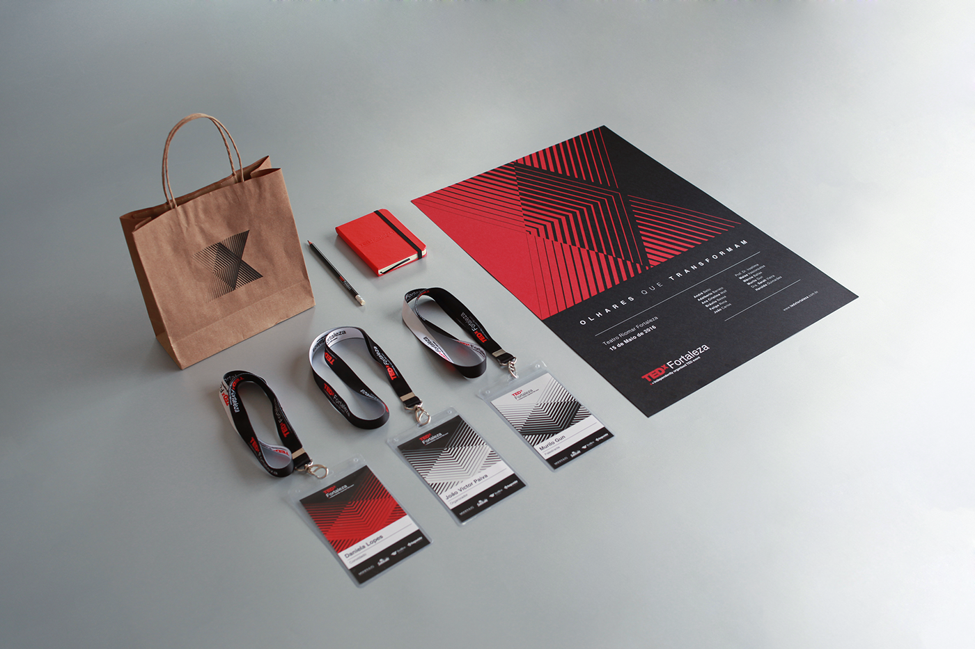
To reach the press and opinion leaders a real kaleidoscope was sent to those people. We invited them to experience the concept by using the object and sharing the images generated by it.
Vibri is a design studio based in Fortaleza, northeast of Brazil. With a multidisciplinary profile, they design projects in many areas of the field but with a lot of focus on editorial design, branding and package design.
For more information about Vibri check out http://www.vibri.com.br/